Cesar Manrique: what can South Yorkshire learn from Lanzarote?
I had my first taste of the Canary Islands this year. I was prepared for black sand on Lanazarote, steep volcanic hills (we were planning to cycle) and palm trees (we were staying in Haria, in the “valley of a thousand palms”). But the work of Cesar Manrique was an unexpected delight.
When I told friends I was going to Lanzarote, everyone mentioned Manrique and his “James Bond” style houses. I had never heard of him and this didn’t sound like my kind of thing. But I thought visiting his projects would add an interesting cultural dimension to an outdoorsy trip. So I started to investigate.
I was intrigued: he was part artist, part architect, part landscape architect, part environmental activist, the creator of a significant number of projects across the island, that took inspiration from its unique natural context. And he had managed to collaborate with local government officials to influence and secure support for a set of wide-ranging policies to protect more generally the island’s distinctive landscape and built form.
This combination of demonstration projects and general design principles resonated with me: it is how I believe you can make lasting change in a place.
I was inspired by his vision for the island, his passion for its unique environment and the coherence and consistency of his design language that is rooted in a detailed understanding of the place.
Lanzarote is very different from South Yorkshire and yet many of the themes explored in his work are familiar: striking landform, vernacular buildings, long views, local materials. Could reflecting on his approach help us build better homes and places?
Cesar Manrique

Cesar Manrique was born in 1919 on Lanzarote, a volcanic island off the coast of north Africa. He spent his childhood summer holidays in Famara, with its sandy surfing beach at the foot of 400m high cliffs. The raw and dramatic landscape made a deep and lasting impression. He went to join the Spanish civil war, started a degree in architecture and then decided to become an artist. He worked successfully as a painter and sculptor in Madrid for twenty years before moving to New York City.
He returned to Lanzarote in 1966 and started a long-term collaboration with the local council. In 1978 he was awarded the World Prize for Ecology and Tourism in recognition of his work on the island: a set of extraordinary projects (both public and private) alongside work to protect the natural environment and traditional Canarian buildings.
Right up until his death in a car crash in 1992, he continued to protest against insensitive tourism development, standing in the way of bulldozers and JCBs and railing against what he saw as short-sighted and damaging changes to the island.


Design principles with impact
The north of the island remains remarkably unspoilt, despite its dependence on tourism. This is largely down to Manrique’s influence. He encouraged the local council to adopt and adhere to a strict set of principles that would preserve the character of the villages and landscape including: no buildings over two storeys high, no advertising hoardings, no overhead cables, no municipal clutter.

haria, in the “valley of a thousand palms”
He documented the Canarian vernacular in a comprehensive catalogue of drawings and persuaded the authorities that it should be preserved and emulated in all new buildings: low white sugar cube houses with dark timber doors and shutters and distinctive emerald green external paintwork, with blue paintwork allowed where the homes face the sea.
He described how the roads should be rolled out like carpet with white lines at the edges and the black lava coming to meet them, with nothing in between. Simple but surprisingly effective. We forget how much “stuff” has crept into our built environment.

local vernacular in downtown haria

a canarian manor house in haria with its terraced orange grove

black paintwork and dark timber contraST WITH WHITE WALLS AT THE PALACIO SPINOLA AT TEGUISE, AN 18TH CENTURY BUILDING RESTORED BY MANRIQUE.

GREEN PAINTWORK IN HARIA
Anyone who has tried to write a design code for a neighbourhood, or a set of principles for a town or city, will know how challenging it is to write something truly place-specific rather than just resorting to generic “any place” clichés.
He nailed this through a deep understanding of the place and its built form. He managed both to get right to the essence of the place and keep to a few simple rules. And then persuade people with influence to adopt them. Ruthlessly.
I would love to see how Manrique communicated his design principles. Was it through conversation or a written document?
It turns out that a set of simple design principles, rooted authentically in a place and consistently applied, can create a beautiful and satisfying background to everyday life.
Demonstration projects and “big ideas”
As well as influencing the overall look and feel of the island, Manrique implemented a series of key projects that have become local landmarks and popular visitor attractions.
Each of these projects illustrates his overarching design philosophy – the symbiosis of man with nature – through a number of themes or “big ideas”:
# Landform and nature as inspiration – Lanzarote was reshaped by a series of volcanic eruptions in the late 18th century that left the island like a moonscape, all rocky cliffs and black, gravelly soil. Manrique’s schemes celebrate in extraordinary ways the volcanic tunnels and bubbles that remain, creating sculptural and underground spaces within them. The projects also celebrate the island’s unique natural environment, its geology, ecology and plant life.
# Local vernacular reimagined – having catalogued local buildings on the island, Manrique understood in minute detail the existing vernacular. He also drew on the distinctive lava walls and wind screens (or “socos”) that are found in the terraces and vineyards of the productive landscape. His projects are both faithful to the island’s precedents and strikingly modern.
# Views that orientate – places with dramatic topography can be disorientating. Manrique understood the importance of views that connect people to their place. His buildings frame views to the sea and the hills.
# Places that are welcoming and make you smile – there is always a bar or a café! And lots of human detail and design “jokes”. People are expected to enjoy themselves.
# A consistent palette of local materials – he uses the same materials, and often the same details, across all his schemes, all of which derive from the local natural and built environment. This gives a unity to his work and binds it to its place.
Below I describe how these themes play out in three projects:
Jameos del Agua – a natural auditorium, museum and science centre
Mirador del Rio – a cliff-top viewpoint over the sea
Jardin del Cactus – a botanical garden
The “big ideas” unify a disparate set of demonstration projects that run the length of the island, and bind them to the place. They provide the weft in the fabric created by the design principles.
Jameos del Agua (1968-77)
The word “jameo” refers to the hole that is created when the roof of a volcanic tube collapses. The openings are part of a 6km long lava tube created when the Montana La Corona erupted.
The site comprises three jameos or openings: the first one houses a restaurant that leads to the Tunnel of La Atlantida, home to a unique species of blind, albino crab; the second houses a swimming pool; and the third a natural auditorium. Above is a modern museum and scientific centre devoted to the study of volcanoes. And a bar (of course).
He explored similar themes in the house he built for himself at Taro de Tahiche at around the same time.

the tunnel of la atlantida, home to the blind, albino crab, a species unique to lanzarote. the tunnel links the first jameo (the restaurant) with the second (the swimming pool). you can see in the background how steps are cut into the volcano to link the two spaces. plants, built-in timber seats and cafe tables make the rocky landscape hospitable.

the swimming pool at jameos del agua is sculpted into the second volcanic opening. a single palm tree provides shade. other plants have colonised the volcano wall. the organic shape of the pool, the palm tree, the white painted concrete and the black lava boulders are mirrored at the taro house.

the LOWER STOREY OF THE house at taro is made of five volcanic bubbles linked by corridors sculpted from the lava. each bubble houses a space with a different function. plants integrated with the lava and built form evoke the natural habitats of the island.

the swimming pool at taro occupies one of the five bubbles. there is always something orangE in manrique’s work (INSPIRED BY THE volcanic fires or the ORANGE GROVES?). aT JAMEOS DEL AGUA IT IS THE SAIL-LIKE AWNING OVER THE RESTAURANT. AT TARO IT IS THE POOLSIDE SEATS.

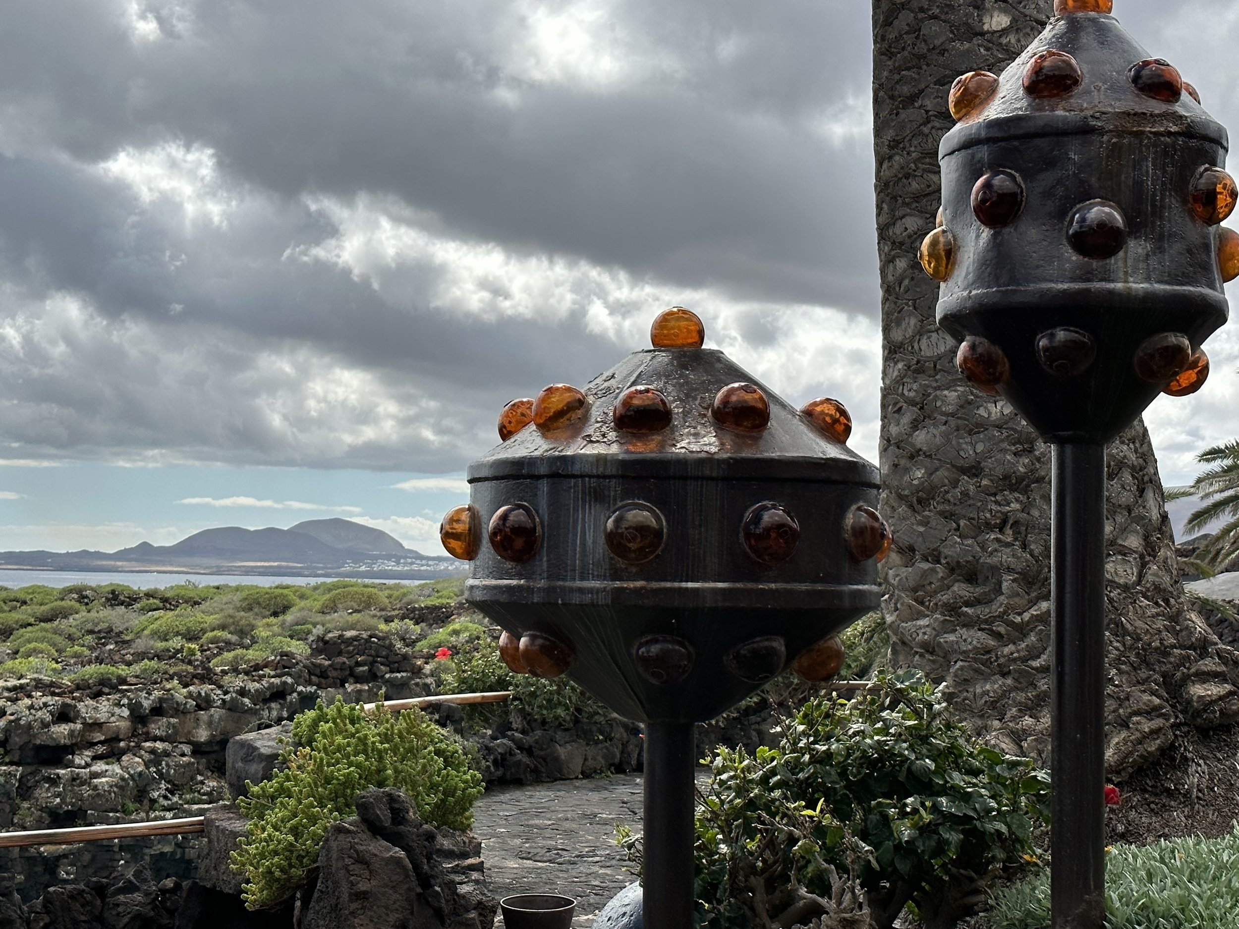
the top level at jameos del agua links the auditorium to the exhibition centre above. playful, orange lights evoke lobster pots, the logo for the site. the careful use of levels ensures an uninterrupted view across natural scrub to the sea and volcanoes beyond.

big picture windows at taro frame the view inland to the volcano, this time across the barren lava. a lava planter with cactus creates an indoor version of the landscape beyond.

the exhibition centre is a modern take on the canarian vernacular. big windows frame the view to the sea and merge indoor lava walls and plants with the landscape beyond. ancient timbers incorporated in the interior add to the marine theme.

the exhibition centre seen from the outside with manrique’s trademark porthole window and black planters against white walls. the balustrade is of a traditional design in characteristic dark wood.
Mirador del Rio (1973)
The Mirador is a viewpoint built at the top of a cliff 479 metres high, used as a lookout for marauding pirates from the 16th century.
Manrique had a large room excavated out of the cliff top and covered the vaulted roofs with earth and grass to conceal it. As a result the building is invisible from the sea. A series of lava walls have been constructed on the land side which skillfully blend the structure into the landscape. This dialogue between land and sea runs through the building.
The main feature is a spectacular viewing space housing a café that looks out onto the island of La Graciosa, the “rio” or small strip of sea between it and Lanzarote and the incredibly beautiful and unspoilt beach at El Risco.

THE MIRADOR IS DUG INTO THE CLIFF. three seamless layers of lava wall APPEAR to form a single structure AND the concealed entrance gives no clue as to what is beyond. THE FISH AND BIRD LOGO FOR THE SITE REPRESENTS THE DIALOGUE BETWEEN LAND AND SEA THAT IS THE THEME FOR THE BUILDING.

THE PORTHOLE WINDOW GIVES VIEWS (ON A CLEAR DAY!) TO THE VOLCANOES INLAND. THE CUSHIONS (IN ORANGE, OF COURSE) MAKE THE SCULPTED NICHE MORE WELCOMING.

THE ENTRANCE CORRIDOR WELCOMES VISITORS WITH A WARMLY LIT SHELF DISPLAYING LOCAL CERAMICS. THE MOULDED, ORGANIC SHAPES EVOKE THE INTERIOR OF THE VOLCANO.
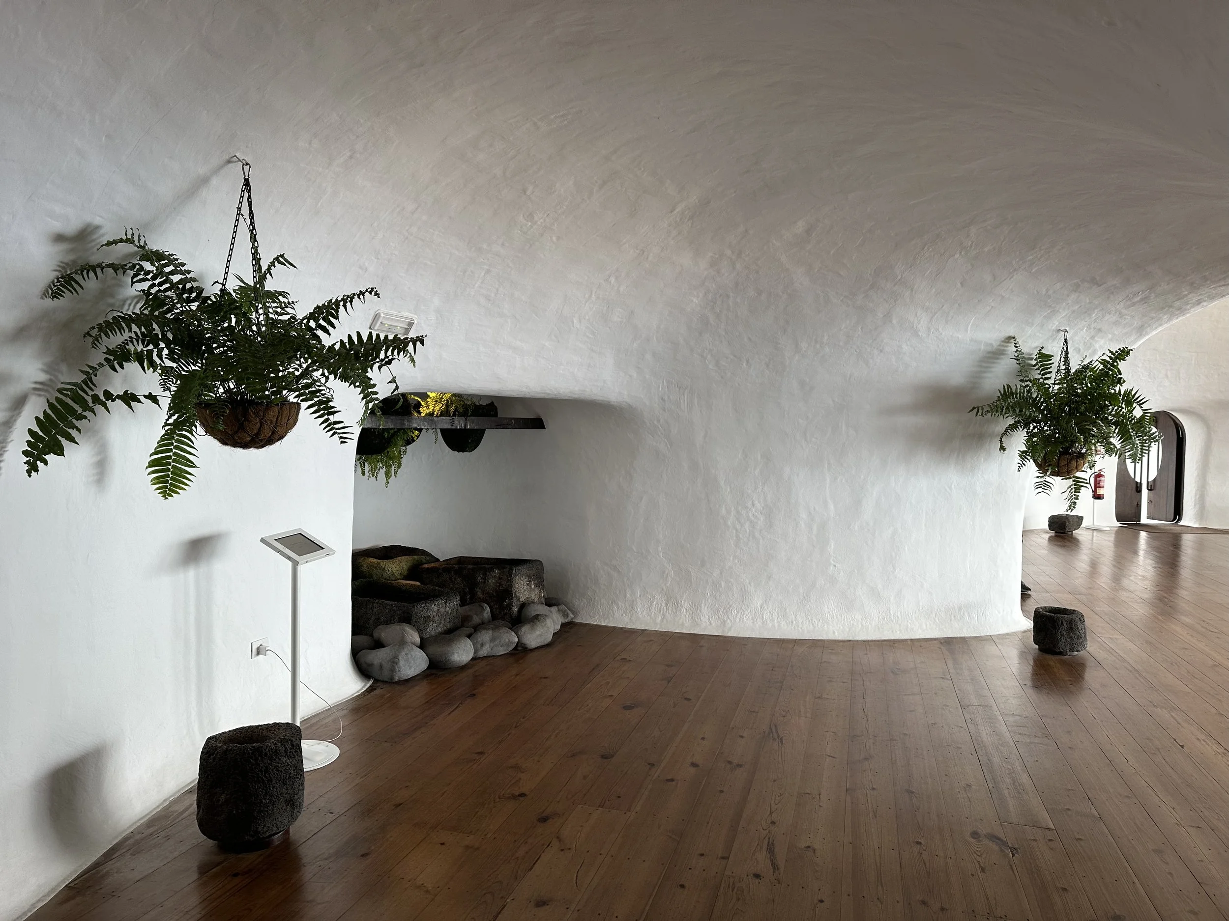
THE CORRIDOR OPENS OUT ONTO A VAULTED ROOM PAINTED WHITE. HANGING PLANTS ARE POSITIONED OVER AN INDOOR POOL AND LAVA BASINS TO CATCH ANY DRIPS AND PROTECT THE DARK TIMBER FLOORING.

THE BAR IS POSITIONED IN AN ALCOVE ON THE LAND SIDE OF THE BUILDING, LIT BY A WARM ORANGE GLOW. THERE IS NO CLUTTER, JUST A DISCREET METAL BIN, DESIGNED BY MANRIQUE. ALL THE OUTDOOR BINS AND SIGNAGE ARE OF A SIMILAR DESIGN. EVERY DETAIL HAS BEEN CONSIDERED AS PART OF THE WHOLE.

THE CORRIDOR OPENS INTO THE MAIN ROOM, A CAFE WITH BREATHTAKING VIEWs OF THE SEA AND THE ISLAND OF LA GRACIOSA. THE CURVED WINDOWS ARE LIKE TWO EYES ONTO THE VIEW. FROM THE SEA THEY ARE INVISIBLE. OUTSIDE THERE ARE ROCKY TERRACES WITH LAVA SEATS AND NATURALISTIC PLANTING OF LAVENDER AND SEDUM.

CURVED SEATING, BUILT-IN AND FREE STANDING, is of a similar design to the outdoor seats at JAMEOS DEL AGUA. dark timber flooring and stair treads stand out against the white walls.

spectacular ceiling lights add to the drama of the space. the metalwork is the same colour palette as the bins and outdoor furniture.
Jardin de Cactus (1989)
A botanical garden displaying 10,000 species of cactus, is contained within a walled amphitheatre made from a former quarry. There is a café...
The garden is located in the heart of Lanzarote’s cactus growing country, where 300 acres are still given over to the cultivation of the Tunera or prickly pear cacti. These cacti were once central to the production of cochineal, an important island industry.
The plant selection, design and layout were not Manrique’s but the work of an eminent botanist, Estanislao Gonzales Ferrer. That said, the planting looks like the work of an artist. The collection has been drawn from the Canary Islands, Madagascar and America.

it’s a cactus garden! the gates and bin are in the same metalwork as the furniture at the mirador.

the entrance to the garden conceals the spectacle beyond. cactus specimens in niches on black soil hint at what is to come.

the view from the entrance lobby. a porthole window frames the whole garden. note the now familiar indoor plants and white walls.

the garden is built within a former quarry. locating the entrance at a level above the main garden creates a dramatic panoramic view of the whole site. the windmill and volcano are landmarks that anchor the garden in the built and natural environment of the island.

the black gravel contrasts with the rock paving and is raked to perfection. spiky lanterns light the way at night. the local prickly pear cactus is planted on top of the boundary wall, a playful version of barbed wire or broken glass.

the walls that enclose the site are built from local stone and the terraces evoke the farmed landscape. they provide space for displaying many of the smaller cacti. the planting design is more painterly than most botanical collections.

the trademark cafe overlooks the garden. the orange sail awning on a cat’s cradle of wires is like the one at jameos del agua.

cartoon cacti are used to dramatic effect.

the planting is sculptural.

and comical in places.

The Planting design highlights differences in the cacti species.

beautiful walling and a discreet balustrade detail. lava cacti planters make a safe edge to the steps.

boulders of local rock are used as sculptures and carved into water features.

the interior with its familiar white walls, dark timber treads and indoor planting. but this time with a cactus-themed light sculpture.
What can we learn from Manrique?
Manrique’s approach resonated with me and made me reflect on my practice over the years. What makes his work so successful? And what can we learn from him?
# Start with the raw ingredients of a place - it’s the most authentic stuff you have. The landform, the natural and built environment and the stories people tell you are specific to your place, and therefore provide the best springboard for place-making.
At SOAR (Southey Owlerton Area Regeneration), conversations with local people generated a set of 5 “big ideas” that referenced the topography and landscape. “See and be seen” was about capitalising on the amazing views in and out of the area that people highlighted as a special feature of their neighbourhoods. “Identity from landform” was about grounding the character of individual neighbourhoods in natural landscape patterns, differentiating the design language of hilltops and edges from slopes and valleys. At South Yorkshire Housing Association, our design language derives from the colours, materials and built precedents in the landscape.
What Manrique did brilliantly was to distill, out of his intimate knowledge of the island, a design language which he applied across all spatial scales from “big ideas” to the tiniest details. It’s not enough to do the thinking; you have to apply the thinking consistently for it to have impact.
# Keep it simple and consistent - a handful of stories or ideas, repeated will build a strong image of a place in people’s heads.
At SOAR we used neighbourhood diagrams to communicate the key projects that were needed in each neighbourhood. At South Yorkshire Housing Association our organisational purpose underpins the design of all our homes and green spaces.
What Manrique shows is that less really is more: his design rules, his key themes, his palette of materials are just so recognisable and easy to carry in your head.
# Demonstration projects work - a few good projects taken together go a long way to establish the identity of a place.
I have learned that you don’t have to change everything in a place to make a difference. At SOAR we focused on a handful of projects in each neighbourhood: a community building, new homes, the neighbourhood centre, a park. At South Yorkshire Housing Association, we have a modest housing development programme, but we aim to develop sites that will have an impact beyond their boundary.
Manrique’s set of projects are dotted across the length and breadth of the island. Their even spread creates impact. And although all the projects are different in function, they are united and reinforced by an authentic and consistent design language.
# Make design principles place-specific - so that they resonate with the people who live there.
At SOAR we worked really hard to develop a set of principles that were rooted in the particular concerns of the people and place, focused on social, environmental and economic objectives. They were nonetheless pretty high-level. At South Yorkshire Housing Association we have co-produced with our customers a design checklist for our new homes that aims to communicate to our design teams how our homes can deliver on our purpose. It is lengthy.
Manrique seems to have been able to boil his design principles down to a few simple rules. It may be that having implemented a series of projects, it is easier to envisage those rules, but his thinking does seem to have been enviably clear.
# Have fun - make places that people will enjoy!
At SOAR we started with the things that people said they loved about living in their neighbourhood and built the plans and projects from there. And the demonstration projects - especially the community buildings and the parks - were designed to be enjoyable and inspiring. At South Yorkshire Housing Association part of our purpose is that our customers experience with us should be a joy. We aim for beauty and joy in all our schemes.
But what I love about Manrique’s work is that his projects are above all designed to entertain: fabulous views, good food and drink, comfortable seats, amusing details. That aspect of his work has stayed with me.
Further information:
There is nothing better than visiting Manrique’s work in person.
And if you go to his house in Haria, I highly recommend the one hour(!) film of his life and work that you can watch in a shady corner of his garden.